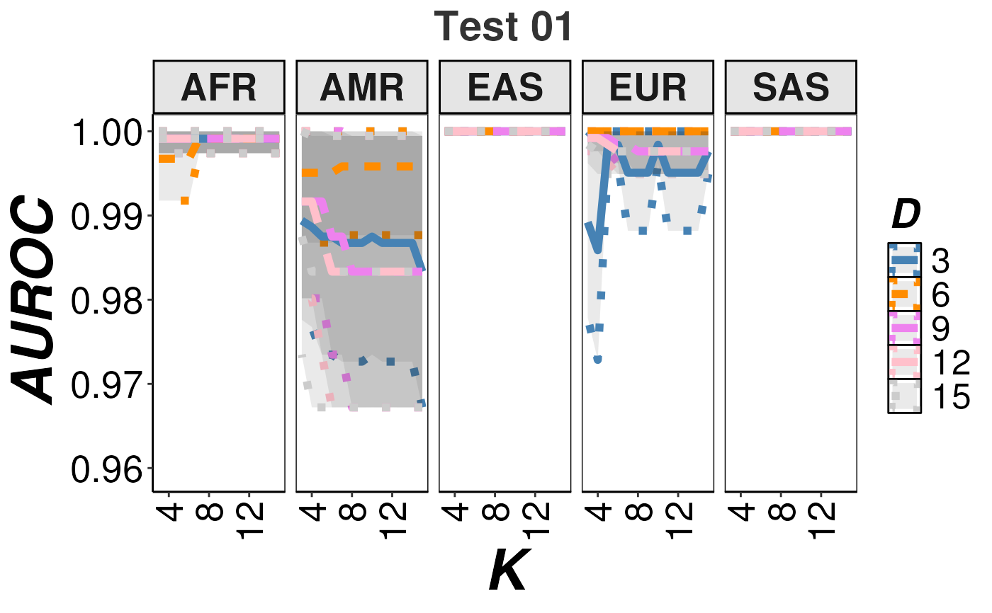
This function extracts the required information from an output generated by RAIDS to create a graphic representation of the accuracy for different values of PCA dimensions and K-neighbors through all tested ancestries.
Arguments
- fileRDS
a
characterstring representing the path and file name of the RDS file containing the ancestry information as generated by RAIDS.- title
a
characterstring representing the title of the graph. Default:"".- selectD
a
arrayofintegerrepresenting the selected PCA dimensions to plot. The length of thearraycannot be more than 5 entries. The dimensions must tested by RAIDS (i.e. be present in the RDS file). Default:c(3,7,11).- selectColor
a
arrayofcharacterstrings representing the selected colors for the associated PCA dimensions to plot. The length of thearraymust correspond to the length of theselectDparameter. In addition, the length of thearraycannot be more than 5 entries. Default:c("#5e688a", "#cd5700", "#CC79A7").
Value
a ggplot object containing the graphic representation of the
accuracy for different values of PCA dimensions and K-neighbors through
all tested ancestries.
Examples
## Required library
library(ggplot2)

## Path to RDS file with ancestry information generated by RAIDS (demo file)
dataDir <- system.file("extdata", package="RAIDS")
fileRDS <- file.path(dataDir, "TEST_01.infoCall.RDS")

## Create accuracy graph
accuracyGraph <- createAccuracyGraph(fileRDS=fileRDS, title="Test 01",
    selectD=c(3,6,9,12,15),
    selectColor=c("steelblue", "darkorange", "violet", "pink", "gray80"))

accuracyGraph